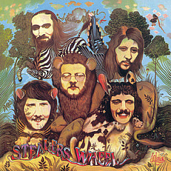
In our Songfactor's Choice Forum, we took a vote: What bands have the best logos? Of the selections, most were created by professional designers (including two from the same art college), while one was thought up by a roadie and another by the group's drug guru. For Queen, Phish, and possibly Guns N' Roses, a band member who dabbled in art came up with the look.
To explain the aesthetics, we contacted John McWade, who runs the outstanding design magazine Before & After. In his renown Design Talk series, John often writes about creating effective logos and how to use them.
Says John: "In general logo design, you're looking for beauty, simplicity, and clarity. A litmus test: Show someone the logo for three seconds, take it away, then ask what they remember.
Everything we know and love (or hate) about a band is embodied in its logo, which can make criticism feel personal. If we love the band, we'll tend to love and defend its logo. I've been asked to comment on the graphics, not the bands. Try to keep them separate."
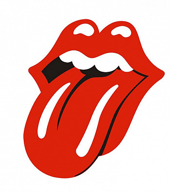
1. The Rolling Stones
John Pasche was taking a graduate design course at the Royal College of Art in London when he was commissioned to create a poster for The Rolling Stones 1970 European tour. His design so impressed Mick Jagger that the famous frontman asked him to design a logo for use on note cards and press materials. Jagger suggested an image of the Hindu goddess Kali The Destroyer (pictured inset) as a starting point, and Pasche went from there.
"The design concept for the Tongue was to represent the band's anti-authoritarian attitude," he told The Rock and Roll Report. "Mick's mouth and the obvious sexual connotations. I designed it in such a way that it was easily reproduced and in a style which I thought could stand the test of time."
The logo first appeared on VIP passes for a Stones concert in March 1971. A month later, it got a public debut on the inner sleeve of their 1971 album Sticky Fingers, the one with a working zipper on the cover, which was designed by Andy Warhol. The band also used it as the mark for their new record label, Rolling Stones Records, and have used it on every album cover since its inception.
Pasche got a lot more work in the rock design niche. He created art for Jethro Tull, Art of Noise, Sinead O'Connor, Steeleye Span and many others.
John Says:
Cartoony and vulgar at the same time, an image everyone can relate to. Simple colors and shapes, bold, memorable, goofy, fun. As a logo, it's the best one here.

2. The Monkees
Ed Justin, an executive at The Monkees' TV production company Screen Gems, got the idea for the guitar logo - somewhat ironic as the group didn't play on their records when they started (here's a woman who did). He hired the designer Nick LoBianco to create the logo, which was used on the deluge of Monkees merch. Some of the items available for purchase: lunch boxes, hand puppets, underwear and toy cars. You could even get a set of trading cards featuring Davy, Michael, Peter and Micky.
The logo appeared on their second album, More of The Monkees, and their third, Headquarters, both released in 1967. It often showed up on Micky Dolenz' bass drum during their concerts and in episodes of their TV show.
Note the heart-shaped tuning pegs.
John Says:
Very '60s with its morphable type, well rendered and compact. But a guitar? That's the unimaginative and generic product of a design studio, which makes the image feel as commercial as a car nameplate, like the band.

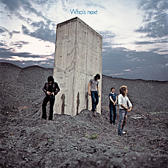
3. The Who
Using the Union Jack as a palette, the Who's target logo used some clever typography. Both words in the band name share a common middle letter, which are joined together, indicating the unity of band and audience that was often a theme for The Who. The O is morphed into the male symbol, making it clear this was a virile bunch (unlike Prince, who blended the male and female icons to create his new moniker).
The famous font look was designed by a British artist named Brian Pike, who used it for a 1964 poster advertising the band's gig at the Marquee Club in London. We contacted Brian Pike, but it turned out to be the wrong one. He tells us that there is also a sand artist with that name and yet another Brian Pike who works with glass, but he has never found the one we were looking for.
The logo has never appeared on an album cover, although the wordmark has been used on some of their compilations. It does, however, look amazing on a T-shirt, and when Keith Moon started wearing one, the endorsement sent the mod crowd to the merch tents in droves. The circular logo also makes a perfect button.
John Says:
On the blue-and-red target it's unreadable, artless, useless. What were they smoking? On white, it's typographically whacked just enough to raise the questions, huh? what? who? Which is probably the point.
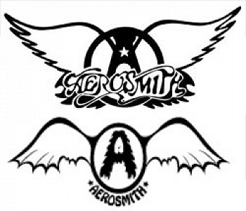
4. Aerosmith
A childhood friend of Steven Tyler, Ray Tabano was the original guitarist in Aerosmith. He was sacked in 1971 in favor of Brad Whitford, but rejoined the band about a year later at Tyler's request - not as a musician, but as a roadie. At first, he was there for the sake of Tyler's sanity, but he took a big role in the band's merchandising efforts when they grew in popularity. Tabano claims that he designed the logo - an "A" inside a circle flanked by wings cribbed from the Harley-Davidson mark - with the band's name in block letters underneath.
In the Aerosmith biography Walk This Way, Tabano says that one of the band's managers, David Krebs, changed the lettering to script and made him sign away rights to the logo, threatening to fire him if he didn't.
The logo first appeared on T-shirts in 1974, and it became so popular that the band has kept it to this day. The early version used on the 1974 Get Your Wings album is the lower image.
John Says:
Hard to read but easy to identify once you know it. Compact and muscular yet graceful. The feathers feel full of air, light and liquid metal at the same time. Nice.

5. Guns N' Roses
The most literal logo on the list, this one has both guns and roses, and in what might be the perfect symbol of the band, thorns. As with just about everything GnR, Slash and Axl don't agree on where it came from. Duff McKagan says in his 2012 autobiography that it was Slash who drew the logo, but Axl has said that it was Bill White, a tattoo artist who did their Appetite For Destruction album cover.
Slash has the pedigree: his mother was a costume designer and his father is a graphic artist. Art is one of his hobbies (he drew up their early flyers), as is film - he owns a production company called Slasher Films.
The logo first appeared on the band's 1986 EP Live Like a Suicide, and has morphed over the years, looking very sleek on the cover of their 2004 Greatest Hits album.
John says:
Barely a logo, more of a storytelling illustration. The most complex image here, hard to reproduce, unexpected for a band. Well designed, however, with good typography, color and symmetry. Would work on a book cover. Gives no clue to the music but makes me want to know more.

6. Phish
This is the logo equivalent of Bob Dylan's "Rainy Day Women #12 And #35." If you're looking for hidden messages - even a "4:20" reference - inspect it carefully with an open mind.
The phunny looking fish was designed by their lead singer/guitarist Trey Anastasio, who was inspired by the psychedelic art of the '60s. It first appeared on their 1986 self-produced cassette known as "The White Tape," and now, in various forms, adorns an assortment of Phishwear.
Phish is one of those bands who can't seem to agree on where their name came from, but the logo may have had something to do with it. Anastasio says the group is named after their drummer, Jon Fishman, but Fishman said in a Relix interview: "When it was time to decide a name for the band, I suggested the sound of an airplane taking off - 'phssssh.' But then we thought that we needed a vowel. Imagine people saying, 'We are going to see Phssssh tonight.' We had already designed the logo and the 'i' fit perfectly in the middle. So Phish was not named after me."
John Says:
'80s band with a '60s look. It's cool - bold, undulating, and dimensional because of the color gradients. The flowing letters have lots of eye-appealing nooks and crannies. A fun image; it looks like a fish and looks like it's moving.

7. Yes
The second entry on our list designed by a Royal College of Art graduate, the Yes bubble logo comes courtesy of Roger Dean, who studied furniture there in the '60s (he designed the Sea Urchin Chair as well as seating at Ronnie Scott's Jazz Club, where Jimi Hendrix played for the last time - here's a guy who was there).
Dean designed the album covers for the British bands Gun, Earth and Fire, Lighthouse, Midnight Sun and Osibisa, establishing a distinctive look with fantasy landscapes and calligraphic text. His first work for Yes was the 1972 cover for the album Fragile, followed by Close to the Edge, Yessongs, and Tales from Topographic Oceans. With a full square foot to work with, Dean took album art to a new level, leading to a nice bump in sales for his clients as curious consumers often based their purchases on what looked good in the rack.
The Yes logo, fully refined on the Close to the Edge cover, became the symbol for the band, proudly used in their commerce to this day, sometimes in a more serpentine form.
Dean's designs became the look of Progressive Rock. He also designed covers for Gentle Giant, Asia and Uriah Heep.
John Says:
My personal favorite but not for its readability, which is very low. Watery shapes almost appear to be pooling; atmospheric colors glow with radiance and contrasting, abstract detail. I've seen this in many patterns and color configurations; this one is the most psychedelic.

8. Grateful Dead
This iconic logo is the first of several images that came to represent the Grateful Dead (others being dancing bears, a skull and roses, dancing terrapins, an Uncle Sam skeleton and a jester). It was designed by the band's soundman/LSD expert Owsley Stanley (who partly inspired the Steely Dan song "Kid Charlemagne") with help from his friend, an artist named Bob Thomas.
One day, while driving in his MGTF, Stanley looked out through the plastic side curtains in the car and saw a sign on the freeway: a circle with a white bar across it. The top of the circle was orange, the bottom blue. This is when the thought occurred to him that he could use a similar design, but with a lightning bolt down the middle at an angle, to mark the band's equipment.
According to Stanley, the Dead played a lot of festival shows with other bands and their equipment would inevitably get mixed together backstage. After a day of music and other indulgences, all those accessories and amps looked alike and inevitably went home with the wrong owners.
Stanley brought the idea to Thomas and a friend of theirs, Ernie Fischbach. Fischbach showed Stanley how to place the logo onto the equipment using a stencil and spray paint, painting half of it red and the other half blue with the white lightning in the middle. Stanley then suggested to Thomas that maybe there was a way he could write "Grateful Dead" or something on the bottom to further mark their territory. Thomas worked on it for a few hours and came away with the now-famous logo.
The skull first appeared on the band's 1976 live album, Steal Your Face, and has grown to represent the Grateful Dead as one of the most recognizable logos of all time.
John Says:
The thin black outlines give this logo a cheap, clip-arty feel, more like a biker gang than a band. Conveys no sense of musicality or artfulness; it's just a skull, an image as common as carrots. The good news is that the band is awesome.

9. AC/DC
Schoolboys are still doodling this one on their book covers to pass the time in history class. Not long after the band chose the name AC/DC (Angus and Malcolm Young's sister Margaret saw it on her sewing machine and suggested it), they began using variations of the letters and lightning bolt. At first, the name and logo was rendered "AC-DC," and sometimes "AC/DC," but they soon embraced the electrical power theme (the name is also slang for "bisexual"), putting the lightning strike between the letters.
Their first album, released in Australia in 1975, was appropriately named High Voltage. The cover showed a dog peeing on an electrical box - a play on the RCA dog logo (is it any wonder why Butthead wears an AC/DC T-shirt?). Their next few releases, as well as their amps, drumkit, T-shirts and buttons, all had the lightning look, but it was wildly inconsistent, with the letters in various font styles and the bolt in different directions.
Inconsistency is the bane of branding, so in 1977 Bob Defrin at their label Atlantic Records hired the artist Gerald Huerta to come up with a definitive look for their Let There Be Rock album cover. Huerta had done some biblical lettering when he designed the Blue Öyster Cult cover for On Your Feet Or On Your Knees, and the look started appearing in all manner of metal imagery. For the AC/DC logo, he tweaked that Blue Öyster Cult design, keeping the sharp edges and bevels.
Their next album, Powerage, used a different look, but every AC/DC album since has featured Huerta's design, with only slight variations. It is the look of Hard Rock.
John Says:
Obviously heavy, obviously metal, bold, dimensional, totally masculine, the blackletter typeface, especially in silver, hints of Nazis, less so in other colors. Powerful, simple, clear, memorable. As a logo it's excellent.

10. Queen
Led Zeppelin weren't the only ones using cryptic symbols to represent their four band members in the '70s. Queen also got into the act, albeit two years after Zep used their markings on their fourth album, released in 1971.
Lead singer Freddie Mercury, armed with a degree in graphic design from Ealing Art College in London, designed the Queen Crest in 1973, the year before it first appeared on the back of their eponymous debut album. It features the zodiac signs of all four members of the band: Two lions (Leo) for bassist John Deacon and drummer Roger Taylor, a crab (Cancer) for guitarist Brian May, and two fairies (Virgo) for Mercury. The lions are embracing a stylized letter Q with a crown on top of it, the crab sits on top of the Q but below the crown, and the fairies are underneath the lions with an enormous phoenix looking on from above.
The logo bears a strong resemblance to the Royal coat of arms of the United Kingdom, which is the image below the Queen logo at right. The Sex Pistols would have put a blade through it, but Mercury, a world traveler who arrived in England as a teenager, was sincere in his homage to his adopted country and their monarchy.
The logo began as a simple line drawing, but was later colorized and evolved into its more intricate present form.
John Says:
A finely rendered crest in 19th-century illustrative style. No clue what the crab's doing in there. Drawn with a light, artistic hand, highly detailed, symmetrical, engaging. I'd expect detailed, artistic music, perhaps with symphonic undertones.

11. Roger Clyne & The Peacemakers
This one narrowly missed our Top 10, and we thought it deserved at least an honorable mention. Roger Clyne is the former Refreshments frontman ("Banditos," "Down Together") who now goes the indie route in Arizona with his band The Peacemakers.
The logo is a tornado inside of a hurricane, and it makes a great bottle opener. "The RCPM glyph is inspired by symbols found in Native American and Southwest imagery," the band explains. "The 'arms' are meant to represent the cyclic continuity of nature and the spiral within symbolizes the emergence and journey of life."
Roger is a living dichotomy, which explains the disconnect with the apparent placidity and the powerful storms. All sorts of opposites show up in his lyrics.
John Says:
By itself, I have no idea what this is, although it meets the simple, bold, memorable requirements of a good logo. I would not have known it's a tornado in a hurricane without being told. Both storms are violent and unpredictable, but this image is placid, centered, stationary, so there's a disconnect. Could be mistaken for a starfish. Unidentifiable to outsiders.
January 29, 2013. Big thanks to John McWade.
More Song Writing